


-
XS Klein Beginnen
Agenda Stad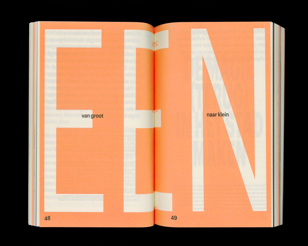
-
Weeping Glass
Museum Boijmans Van Beuningen
-
RIF
Rotterdam Illustration Festival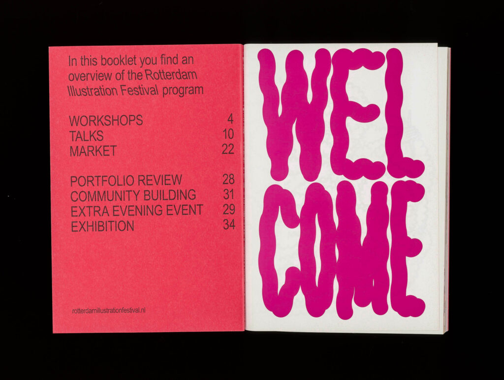
-
Letter Lab
Stedelijk Museum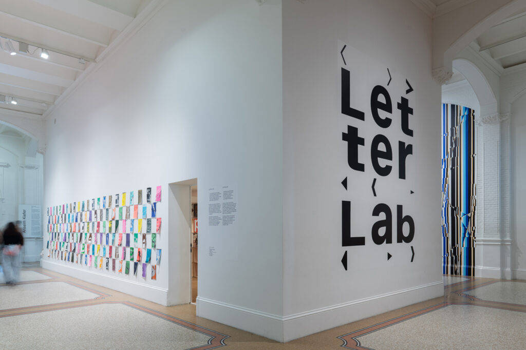
-
Secrets of Italian Drawings
Museum Boijmans Van Beuningen
-
Maarten van Heemskerck
WBooks
-
Veranderland
Het Noordbrabantsmuseum
-
Boijmans van Binnen
Museum Boijmans Van Beuningen
-
Lievelingen
Museum Boijmans Van Beuningen
-
Kolonialisme en Rotterdam
Wereldmuseum Rotterdam
-
In/formal Marketplaces
NAI010 publishers
-
De omgekeerde wereld van Adriaen van de Venne
Zeeuws Museum
-
Van wie is het (platte)land?
Rijksmuseum Twenthe
-
Lothar Wolleh Sees Jan Schoonhoven
Museum Prinsenhof Delft
-
Forum Groningen
NL Architects
-
Patchwork Parkstad
NAI010 publishers
-
The Future Through Artificial Eyes, 20 Years of VPRO Tegenlicht
Het Nieuwe Instituut
-
Sneakers Unboxed
Design Museum Den Bosch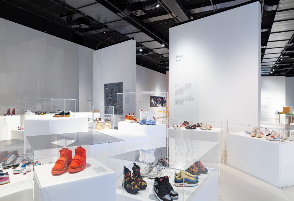
-
Reuzenarbeid
Walburgiskerk
-
Platform Talent 2021
Stimuleringsfonds Creatieve Industrie
-
KOREA
Keramiekmuseum Princessehof
-
New Material Podcast
Het Nieuwe Instituut
-
Artemisia. Woman and Power
Rijksmuseum Twenthe
-
Raging Standstill
Stedelijk Museum Breda
-
Reuzenarbeid
NAI010 publishers
-
Van Doesburg Maquette Grotto
Het Nieuwe Instituut
-
De Afbreekeconomie
Museum Boijmans Van Beuningen
-
Body Language
Museum Catharijneconvent
-
Architecture and Remembrance
NAI010 publishers
-
Wayang Stories
Taman Indonesia
-
Hoop en Liefde
Zeeuws Museum
-
Atelier Nelly + Theo van Doesburg
Het Nieuwe Instituut
-
George Stubbs
Mauritshuis
-
Experience
Zeeuws Museum
-
Nooit Meer Werken
Zeeuws Museum
-
Maestro van Wittel
Kunsthal KAdE
-
Caspar van Wittel
Kunsthal KAdE
-
Ars longa, vita brevis
Rijksmuseum Twenthe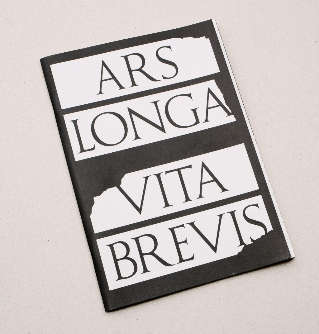
-
Do it Like Droog. 25 jaar Droog Design
Museum Kranenburgh
-
TOO BIG
NAI010 publishers
-
Changemakers
Museum Boijmans Van Beuningen
-
Embassy of Data
Het Nieuwe Instituut
-
Navigating Noise
Walther König Verlag
-
Dit is Zeeland
Zeeuws Museum
-
In the heart of the Renaissance
Rijksmuseum Twenthe
-
Designing the Surface
Het Nieuwe Instituut
-
10 Years of Thomas Eyck
Zuiderzeemuseum
-
Project Rotterdam
Museum Boijmans Van Beuningen
-
Food to Be
Ministerie voor Economische Zaken
-
De Nieuwe Smaak
Rijksmuseum Twenthe
-
Art In The Age Of…
Witte de With
-
Ted Noten
NAI010 publishers
-
Glass
Het Nieuwe Instituut
-
Dijken van Nederland
NAI010 publishers
-
Identity A Tale of a Tub
A Tale of a Tub
-
Means of Production
Dutch Embassy Berlin
-
WOOD
Het Nieuwe Instituut
-
Lost Landscapes
NAI010 publishers
-
Now Japan
Kunsthal KAdE
-
Libraries
Kunstverein Göttingen